
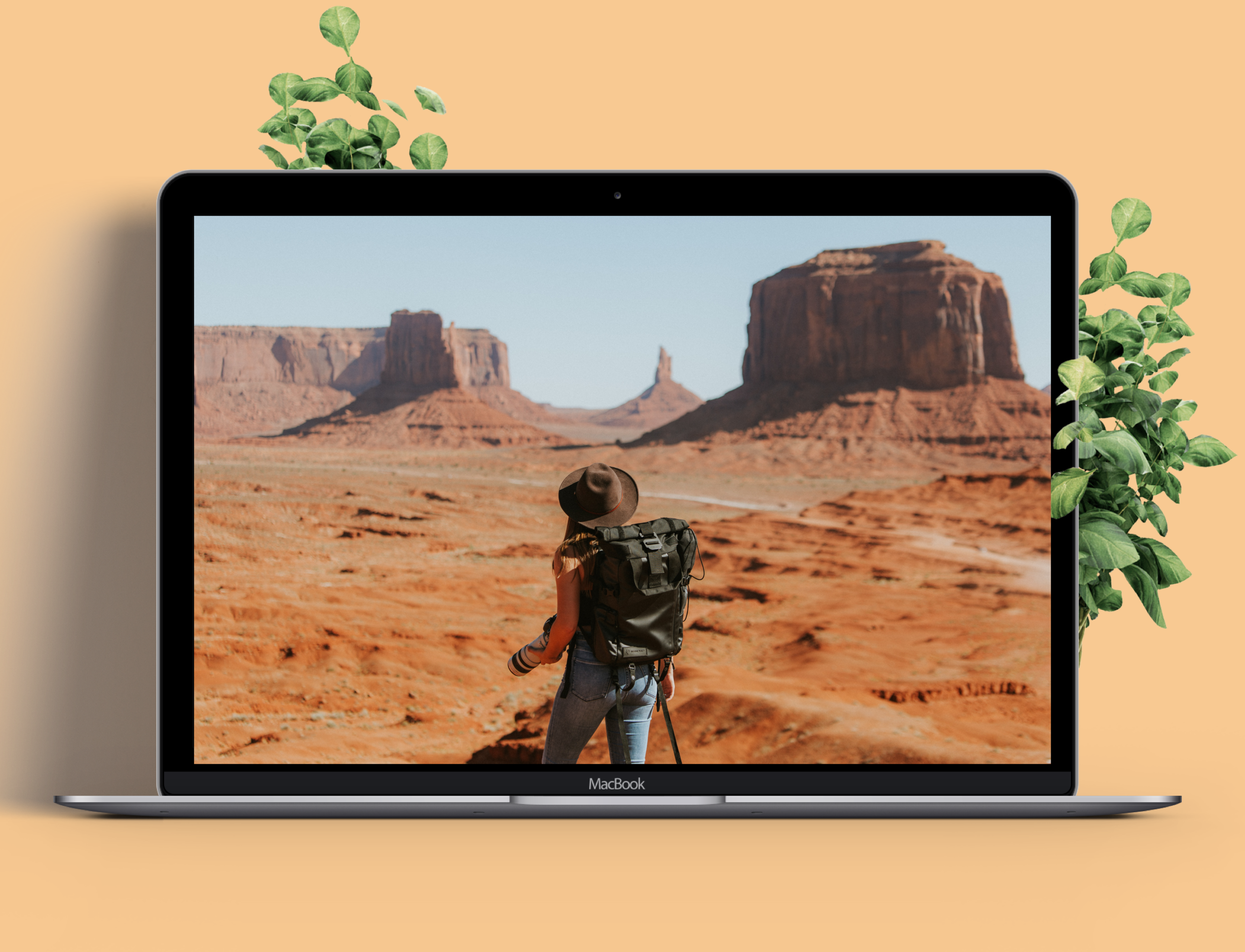
Trail Master is a responsive website dedicated to help users find and plan their next outdoors trip.
Role
Visual Designer, UX Research // Team: 3 UX Designers
Challenges
Users today do not have a single platform to seamlessly book flights, campgrounds, and learn from other campers about their trips. Challenges during this project were to understand how users book their backpacking trips today and identify filtering options that would prove to be the most meaningful.
Solution
Provide users with a responsive website with resources to start planning their trip.
Create a seamless feature to ensure users can save and share their generated trips with other users.
Process
Empathize
Research Methods: Interviews, Shadowing, Competitive Analysis, Card Sorting
Interview Goals:
Identify the top 3 pain points for users that are planning an outdoors backpacking trip.
Identify the current process step by step of how they plan a trip today.
Survey Sample:
4 Males, 3 Females
Ages: 24-33, Urban working professionals that has backpacked at least once before
Define
User Personas:
Starting out we were interested in hearing from people who recently planned an outdoors adventure. By listening to the unique stories of our interviewees, we were able to narrow our focus specifically around the pain points of collaborating on a trip with friends, and finding the right trails based on difficulty level.
Persona’s Journey Map
The persona journey map highlights the user at different stages of their trip planning. Through this, we can identify when their main challenges occur.
Ideate
Site Map
Each page title was written out on paper and re-organized to create what the site map is today. This was re-iterated 2 times after user testing and follow ups with the participants to shadow and understand the justifications for pages needed. After some user testing, I was able to consolidate the account section, and create a “saved trips” page and removed the “category” section.
It is important to note that we removed the category pages as a way to make this more seamless while still populating relevant results for the user. The hybrid model of a randomized generator and one that you would hand pick, is what a majority of those surveyed were looking for.
Design
After better understanding the persona’s behavior and site map, I’ve created the paper wireframes, which then evolved into the lo-fi and hi-fi wireframes. The overall user sentiment was that they prefer to populate new trips from the homepage on desktop, but refer to their saved trips on mobile. Once they are ready they prefer to book their trips on desktop to ensure all of the booking information is correct on a larger screen.
Phase 5: Iterate
Affinity Map:
After creating the hi-fi prototype, we met with the 5 participants in person. We wanted to see their pain points to understand any existing problems with the flow to prioritize. By hierarchically grouping the data, or affinity notes revealed the problems and needs, it acts as the voice of the customer and the issues become the basis for user requirements that I took into account to restructure the wireframes and prototype. Here were our key findings:
Users were able to complete the tasks given
Initially, users were unsure how the options in the “Similar Trip” section were related to each other
Users were unclear on how to access their “Saved Trips” initially

Reflection
This is only the MVP. After the launch, I would love to see the engagement to generate benchmark data. I would implement an A/B testing plan to see if by removing the “category” pages was effective. We would also need to find an effective way to embed the filters from the homepage on the trip landing pages without it being a primary CTA. This would help users on the landing page have the ability to keep the trip location, but also customize it if they change the month they are planning to visit, etc..
Thinking Ahead
Now - MVP
Responsive site that uses essential filters to generate an option for the user to have the trip information consolidated.
Trip sharing and saving capabilities.
Profile features to refer back to trips.
Next - Short-Term
Invest in paid media plan to promote quality site traffic.
Implementing monetization strategies on live site without directly interfering with the user experience.
Later - Long-Term
Once we have benchmark data (at least one quarter’s worth), we can begin A/B testing. Specifically to see if “category pages” would be useful or would increase bounce rates.
Continue monitoring the platform and build out an A/B testing plan for the upcoming quarters.