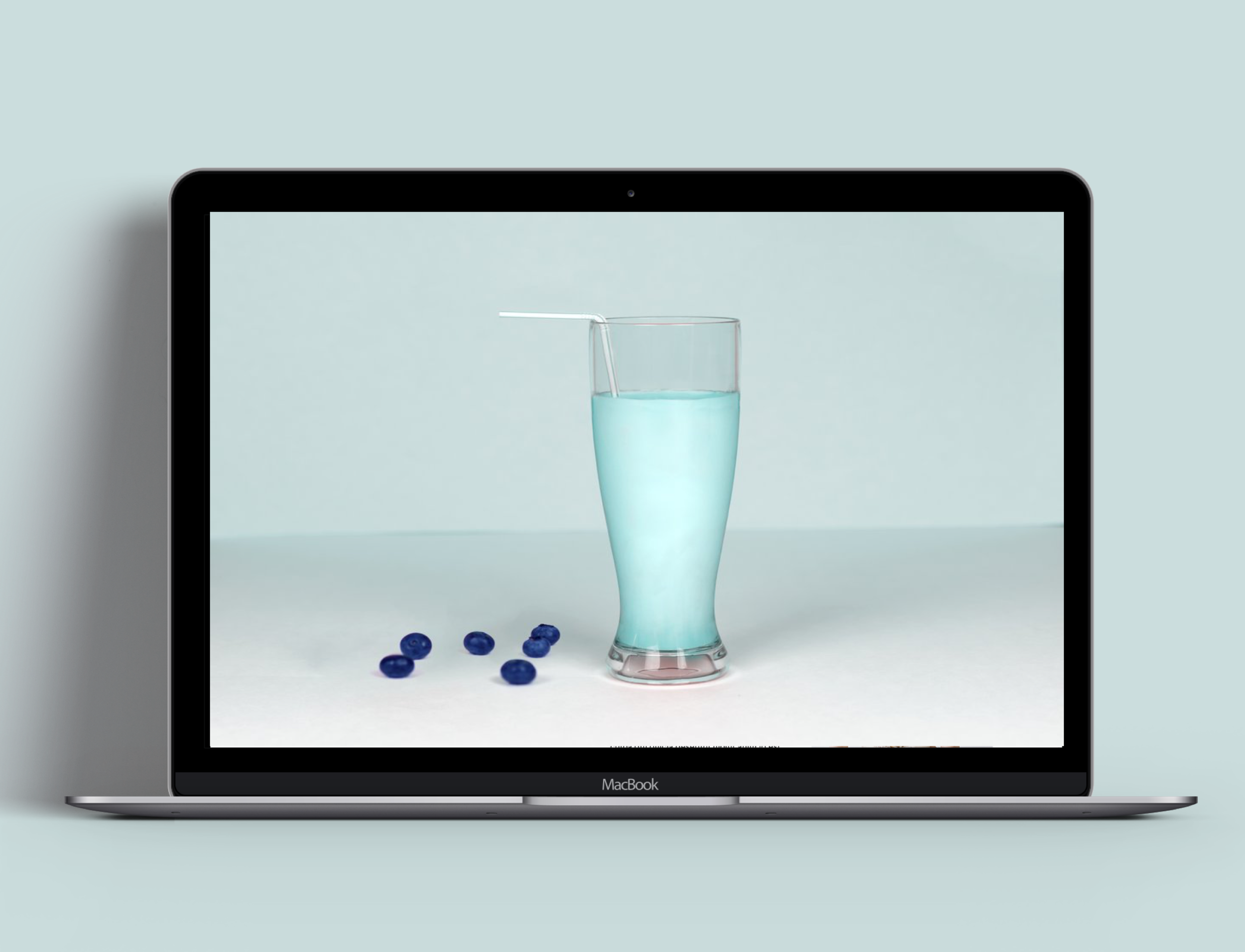
LiquidLab is a privately owned cold press juice bar offering their customers unique customized products. We designed this site from scratch during our time at General Assembly.
Role
Visual Designer, UX Research, Usability Testing // Team: 2 UX Designers
Challenges
The market today is saturated with indirect and direct competitors. Our primary goal on this project was to ensure that customers would be able to digitally navigate the site through search, and design a seamless checkout experience.
Process
Empathize
Research Methods: Interviews, Shadowing, Competitive Analysis
Interview Goals:
Understand how users would interact with finding their customized juice offerings
Understand current pain points with competitors today
Define
After interviewing 7 interview candidates and conducting cart sorting exercises, Ariana, our persona formed. We used this as a guide to set a foundation and understand the audience segment we were designing for.
Ideate
Main Findings after presenting the draft design:
Users were unsure what would happen if you were to click in between products (initially had no boxes around the products).
Users could not easily find the search bar.
Users were unclear with how to leave a review, was that prompted through email after a purchase, etc.
Wireframes
In the final iterations of the Buy Path (shopping bag and checkout pages), we removed the navigation bar and the noise at the top, so users would be pushed through the checkout flow easier without distractions. We kept the navigation and search bar in the shopping bag page so they would build a bigger bag before checking out, if needed. Through testing with users, we broke it down, so users knew what to fill out exactly first before they could proceed, we also added in the “Pay Pal” feature as well, we would initially launch PayPal as a test to see engagement.
Iterate
If I were a full-time team member for this company, I would have many more resources as well as constraints from different teams that I'd need to take into account to fully realize this responsive website.
I would also conduct another round of usability testing. I'd use the same tasks and ask the same questions, then compare the two sets of data.
Reflection
I would continue to iterate, specifically in the checkout flow. I would continue testing on if the PayPal integration was effective, and I if segmenting the checkout flow helped with conversion.
In the browse path, I would test for the optimal placement and messaging for the custom juice plans.

